A new visual identity for a data platform
The data and AI platform of a multinational beverage company had no visual expression of its own. I led the new brand for this global ecosystem: logo, colors, typography and the guide that steers every product on the platform.
Project context
A visual identity guide that brings together every brand component, from the logo and tagline to the color palette and typography, with usage rules, an image bank and applications to ensure consistency across every touchpoint.
The platform was growing as the company's data and AI engine, but each team applied the brand its own way. We needed to translate purpose and mindset into an identity that joined brewing tradition with data precision and showed the platform is part of a global group.
I led the new brand on the Product and Adoption team: from the concept and the symbol to the colors, the typography and the guide with the usage rules that now steers the platform's products.
“Every presentation and every product uses the brand differently, and I never know which logo version or which color is the right one.”
“Have a single guide, with the official files and clear rules, to apply the brand confidently in any format.”
What the brand needed to solve
The brand needed to join brewing tradition with data precision, without looking like just a brewery or just a tech company.
The platform is part of a global group, so the identity had to carry the trust of the parent brand instead of competing with it.
Without defined rules, the brand showed up with distorted logos, off-palette colors and effects that hurt legibility.
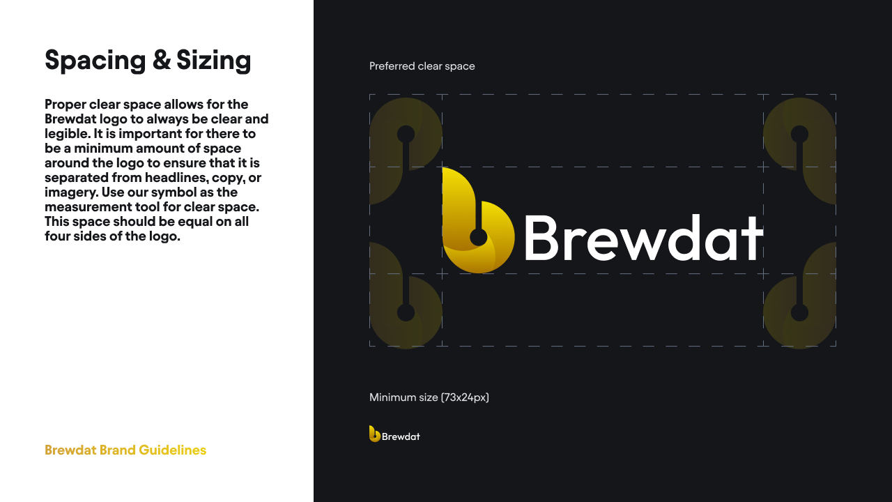
The brand had to work from a product icon to an event banner, legible down to 73×24 px.
From problem to solution
Brand purpose and concept
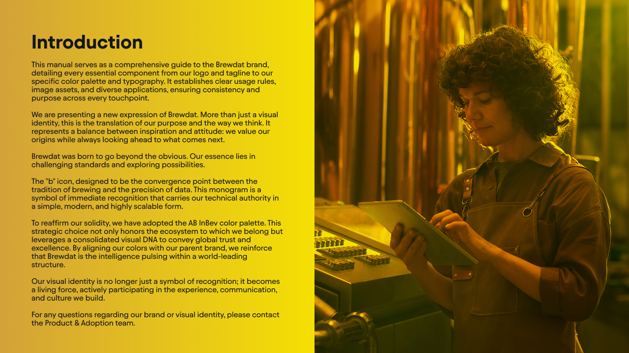
I defined the concept from the platform's purpose: go beyond the obvious, challenge standards and explore possibilities, balancing inspiration and attitude.
Monogram, signature and tagline
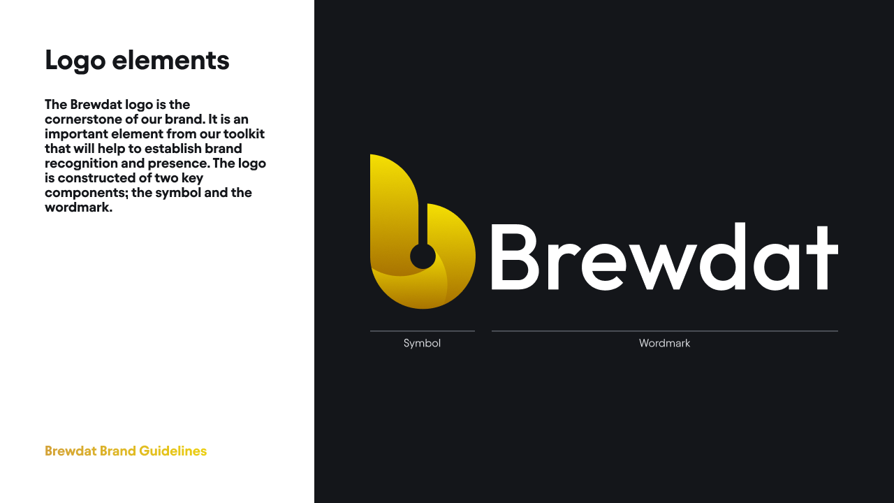
I designed the "b" monogram and the signature, made of symbol and wordmark, and the version with the tagline "Data & AI Platform", in light and dark versions.
Colors and typography
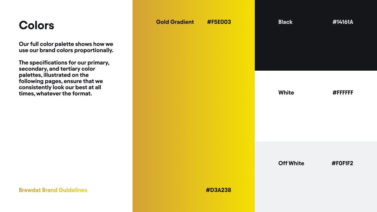
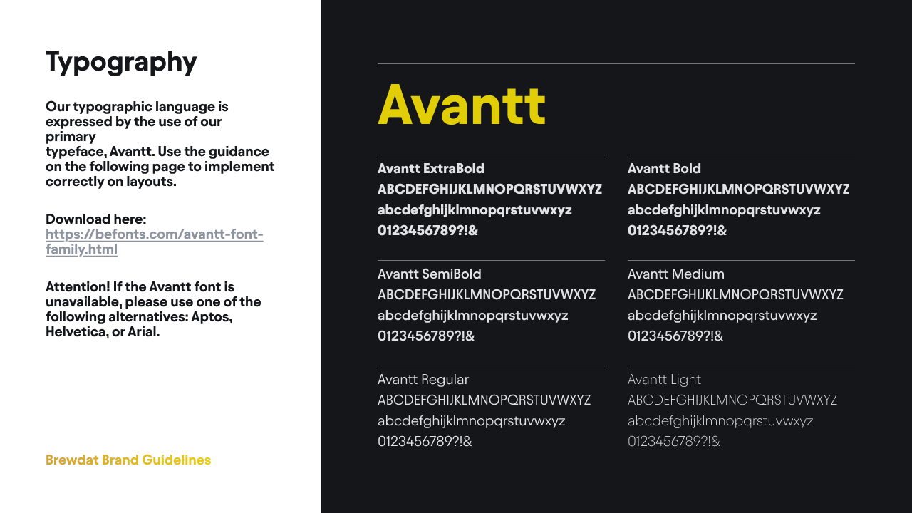
I built the palette from the parent brand's colors, with a golden gradient, black, white and off-white, and chose Avantt as the typeface, with six weights and fallbacks for when it isn't available.
Usage rules, imagery and applications
I wrote the guide with clear space, minimum sizes and prohibited uses, plus photography and isometric illustration guidelines and links to the official files.
A visual walkthrough of the solution
Why each choice matters
A monogram that joins tradition and data
The "b" is where brewing tradition meets data precision: simple, modern, instantly recognizable and easy to scale.
A palette inherited from the parent brand
Using the group's colors reinforces that the platform is the intelligence inside a global structure, building on a visual language that already conveys trust.
Clear rules to scale consistently
Clear space measured by the symbol itself, minimum sizes, prohibited uses and official files in one place let any team apply the brand without depending on design.